Proton Mail —
Security Made Easy
Proton Mail – Proton Calendar – Proton Drive

Industry:
Privacy Tech, Communication
What we did:
iOS & Android Apps
My Role:
Competitive Analysis, UX Research, User Testing, Wireframes & Prototyping, User Experience, Interface Design, Dev Collaboration & Handover
Client website
Challenge:
Proton is a communication company headquartered in Switzerland. Their privacy-focused online services are end-to-end encrypted and all user data is protected by strict Swiss privacy laws and Swiss neutrality.
We were asked to reimagine easy-to-use mobile products that would not compromise on the security and privacy of their users. Their mobile app experience needed to be refurbished and extended with some new services.
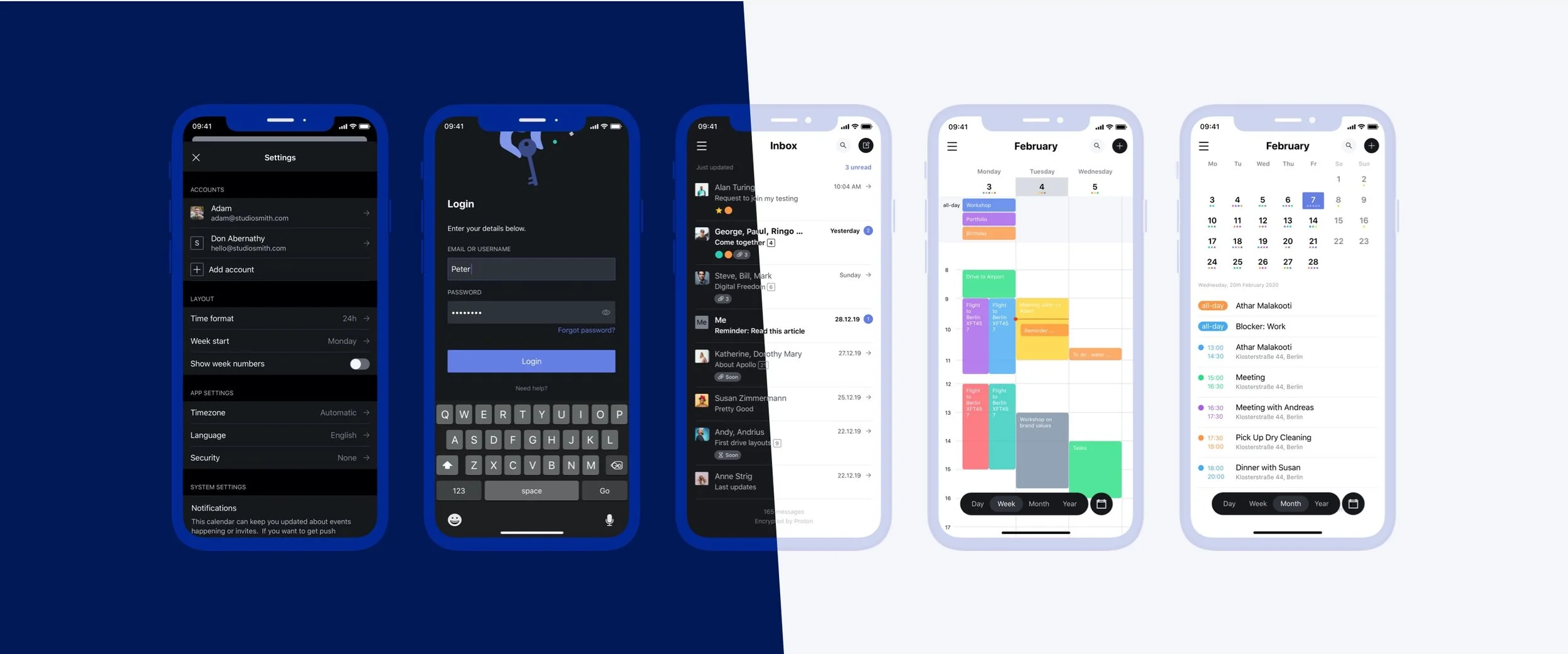
We worked with Product Owners, an in-house Design Lead, and the engineering teams to rethink the entire product family. We redesigned the mobile core product, ProtonMail, then created Calendar and Drive from scratch. All three apps were designed for Android & iOS – that's six projects in less than four months. Layouts were then optimized for smartphone & tablet, as well as light & dark mode.
Product Vision
What kind of product is ProtonMail? Is it a utility tool, all about productivity? Or a conversational tool, moving email UX towards direct messaging? We needed to find a balance between those two approaches.
A utility product is more like a task manager, and each detail is optimized to better read, organize, and send emails. The most important features are organizational ones, like labels and folders. A conversational product, on the other hand, like any messaging app, focuses on creating a chat-like experience, where the conversation view is in focus and recipients are accentuated and visualized with profile pictures. Marrying the two was a thrill.
Areas of Improvement
ProtonMail created an excellent security app used by millions of users. The product was built with a security focus, so there was room for improvement when it came to usability and the general look & feel. We strived for a more modern, minimalistic look with improved contrast and a more distinct color palette.
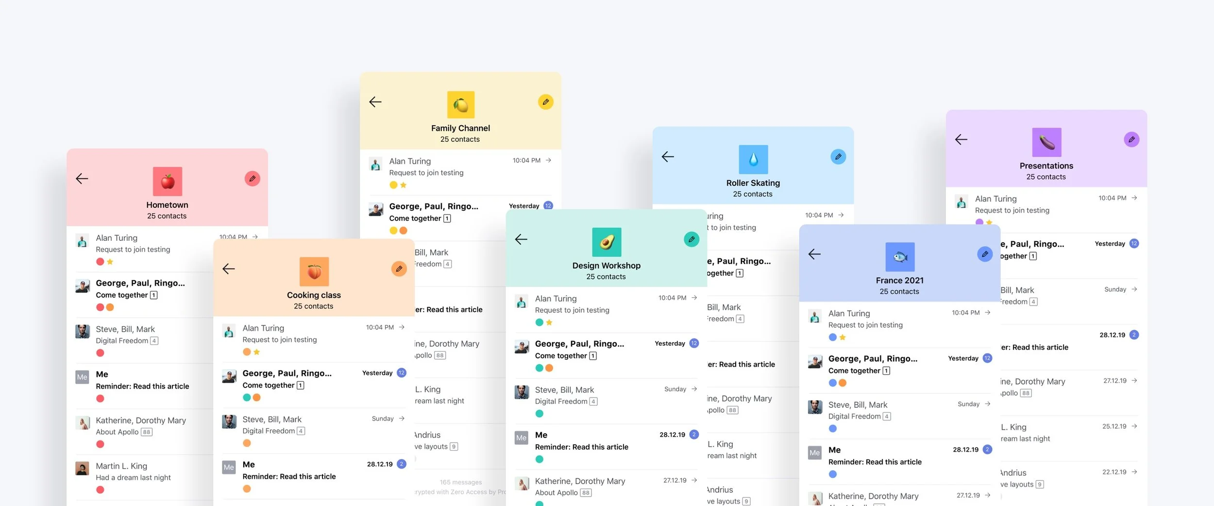
Information architecture needed a review - amongst other things, we restructured the menu and email actions, revisited the icons, decoupled labels and folders, and made the senders more prominent.

Information Architecture
In a mail app, where all the action revolves around your inbox, the list item is arguably the most important component and one of the first to be designed.
A list of your emails is the first thing you see after opening an email app and you need to be instantly informed about the state of your inbox. First, we needed to establish the information architecture. Which emails are new? Which ones require a response? Is the sender trustworthy? What is it about? How many emails have been exchanged so far?
We attempted to put those questions in the order of importance and take it from there.
Make Encryption a Feature – Not a Friction
Proton is building a better internet where privacy is the default. “Your data, your rules” is their guiding principle. Our design needed to convey that strong security approach.
When designing the inbox, we needed to take into account the technical limitations of Proton's structure. All messages in the Proton mailbox are stored with zero-access encryption. That means the message body, as well as the attachments, are fully encrypted and can only be displayed upon opening the email. Letting go of the email's content preview was a big but necessary trade-off. However, subject lines in ProtonMail are not end-to-end encrypted, which meant we could display that information in the email list.
User Avatars
Circular avatars are ubiquitous and - to be honest - easy to use, easy to place, easy to stack. Square explorations turned out challenging but very promising, so we decided to push the topic to its limits. We explored the Proton brand with square, slightly rounded shapes and made square user avatars a brand differentiator. We even accounted for the possibility of using emojis instead of initials. We suspected Proton users would be rather reluctant to upload a photo — showing your face on the internet doesn’t really go hand in hand with privacy.

Proton Calendar — Productivity Designed from Scratch
Calendar offers all the features you expect, plus privacy. You can create events that repeat on a daily, weekly, monthly, or fully customizable basis. Switching between different views allows you to focus on the important events coming up in the next day, week, or month. Notifications and reminders can be customized so you never forget what's coming up next. Calendars for work and family events are separated. All of that protected by the same end-to-end encryption used in Proton Mail.
The suite offers full integration — Proton Calendar comes with a Proton Mail email address that can be used to securely send event invites. You can also add events to Proton Calendar directly from your Proton Mail inbox.

Proton Drive — All Your Files Securely in One Place
Proton Drive is a cloud storage solution with end-to-end encryption. Our design accounted for an automatic cross-device sync – all files are available on all devices, all the time. Files can be made available offline with the possibility of marking single files or folders as offline available. Drive integrates seamlessly into the suite – files can be accessed, saved, and moved from other apps in the ecosystem.
Usability of this product was heavily impacted by encryption – a lot of the file details could not be displayed in list views due to security measures, and we needed to respect these limitations.

How Do the Apps Come Together?
All three apps were designed for iOS and Android. The overwhelming majority of Proton customers use an Android device — the Android version was a priority and needed to feel as native as possible. Dark mode seems to be all the rage these days — so we designed all three products in both light and dark mode. Alongside, we created a UI guide and a design system to maintain the look and feel in components across products. To improve general usability, we aligned common functions like login, navigation, and settings. The integration between apps includes storage space divided between mail, calendar, and drive. The apps also share a contact book for easy communication and handoff.


